A Glitch component
Since we planned to use this in different parts of the page, it made sense to create a component that we could easily reuse. The glitch animation was to be applied only to image elements, not text; and our goal was to use the image itself for the animation — instead of simply adding coloured containers animating around the image, for instance.
The Glitch component renders the main image element along with three additional copies — these additional image elements are the layers that will be animated. Since these copies exist only for decorative purposes, the alt attribute should be empty.
function Glitch({ src, alt, ...rest }) {
  return (
    <div className="glitch-wrapper">
      <img src={src} alt={alt} {...rest} />

      // Using lodash for simplicity but you can manually
      // repeat the html element or do this in plain JS
      {_.times(3, i => (
        <img
          key={i}
          className="glitch-layer"
          src={src}
          alt=""
          {...rest}
        />
      ))}
    </div>
  )
}
The clone images should overlap the main one, so we need to set a position: relative on the parent div and a position: absolute on the clones (we'll add this to the scss mixin later).
.glitch-wrapper {
  position: relative;
}

.glitch-layer {
  position: absolute;
}
Deconstructing the animation
Let’s take a look at the key aspects of the animation that, when combined, created the effect we wanted to achieve.
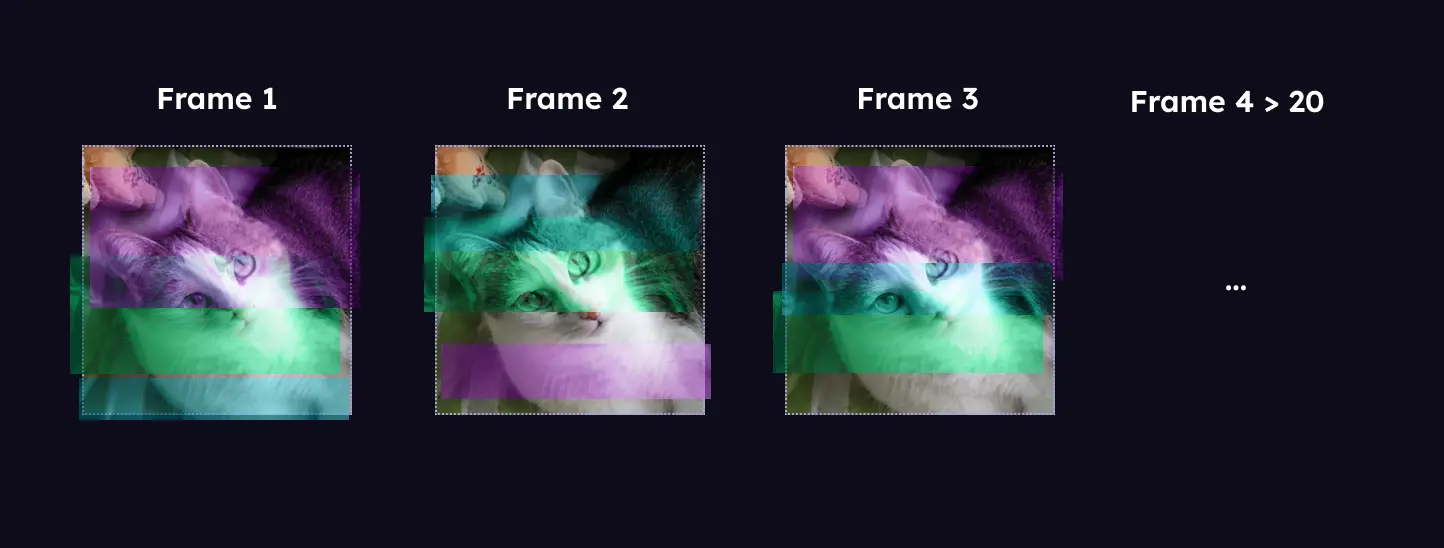
1. Hue filter
First, we apply a filter to each layered image, turning them into a monotone version of the main image, and then applying a hue rotation so that each layer is a different color. The color palette we used was a combination of electric green, blue, and pink; but the tones can be adjusted by editing the values on the hue-rotate added to each layer.
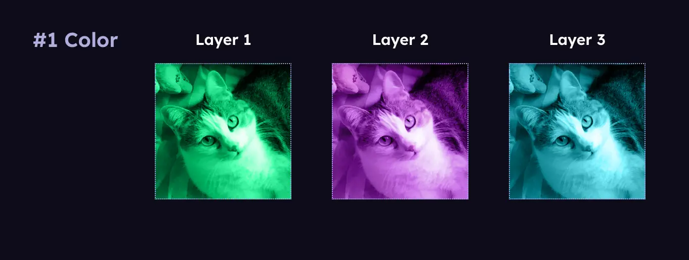
2. Crop
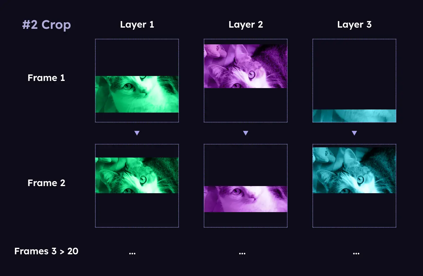
In each frame, we crop the animation layers in horizontal bands of random height. The crop is calculated randomly, so each layer will be cropped differently — and it gets updated on every animation frame.
3. Offset position
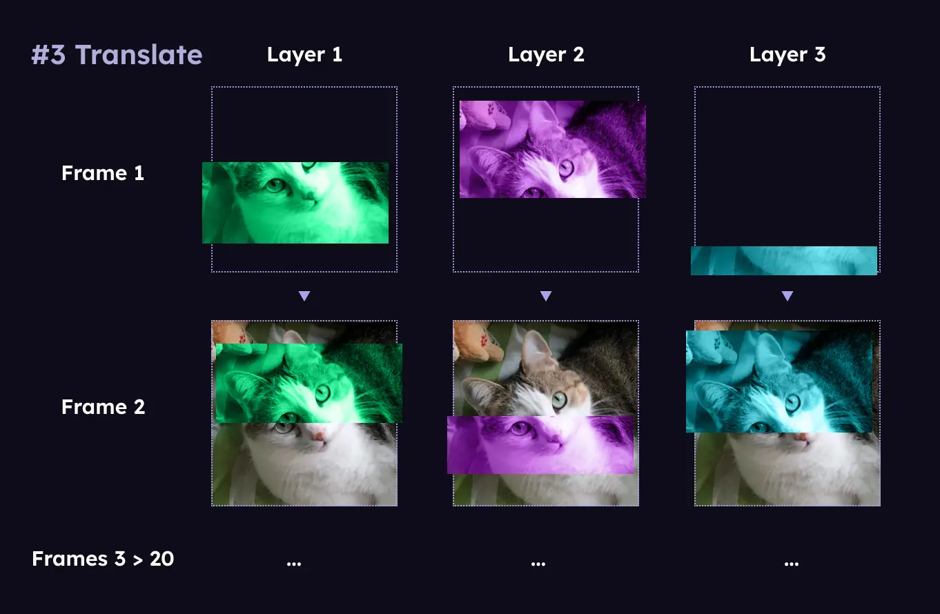
We slightly offset the position of each layer in relation to the main image, using transform: translate(x,x). This subtle shift creates the illusion that horizontal bands of the image (the cropped portions) are moving—kind of like a VHS tape rewinding 🙂
It’s important not to place the layers too far from their original position; otherwise, it becomes obvious that separate elements are appearing, instead of looking like parts of the image are moving. After a few tests, we decided the translation values should fall between -3% and 3% in both directions.
As with the cropping, we update the offset values in every frame to maintain the dynamic effect.
4. Transparency
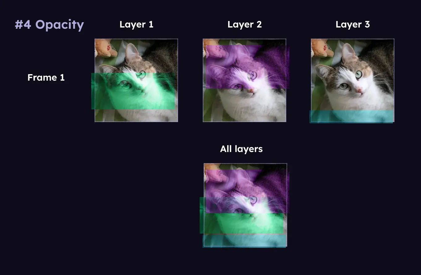
Finally, reducing the opacity of the layers makes the image appear out of focus and allows us to see through the overlapping colors.
Putting it all together
Now, to get the animation all we need to do is update the crop values in each frame.
Building the animation in CSS
We created an SCSS mixing because it allowed us to easily reuse the same animation in the different layers, as well as in other places where we wanted to use the animation without the Glitch component. The parameters on the mixin allowed us to tweak the effect to fit the different instances.
/*
  mixin to create a glitch effect animation
  - $nth-child: specifies the layer number (default is 1)
  - $frames: specifies the number of animation frames (default is 20)
  - $duration: specifies the duration of the animation (default is 2 seconds)
  - $delay: specifies the delay before the animation starts (default is 0 seconds)
*/

@mixin glitch-animation(
  $nth-child: 1,
  $frames: 20,
  $duration: 2s,
  $delay: 0s
) {
  // 1. HUE TONES
  // Color each layer differently based on $nth-child
  @if $nth-child==1 {
    // You can tweak the hue-rotate values in each layer, to achieve
    // a different color palette
    filter: sepia(100%) saturate(300%) brightness(120%) hue-rotate(240deg);
  }
  @else if $nth-child==2 {
    filter: sepia(100%) saturate(300%) brightness(150%) hue-rotate(520deg);
  }
  @else if $nth-child==3 {
    filter: sepia(100%) saturate(300%) brightness(120%) hue-rotate(90deg);
  }

  /* Generate a name for each layer so they animate differently */
  $name: glitch-animation-#{unique-id()};

  @keyframes #{$name} {
    @for $i from 0 through $frames {
      #{percentage($i * (1 / $frames) / 3)} {
        // 2. CROP
        $top-limit: random() * 100%;
        $bottom-limit: random() * 100%;

        clip-path: polygon(
          0% $top-limit,
          100% $top-limit,
          100% $bottom-limit,
          0% $bottom-limit
        );

        // 3. OFFSET
        @for $i from 1 through 3 {
          @if $nth-child == $i {
            // Offset the layer position in proportion to image size
            // (between -3% and 3% in each direction)
            $translate-x: random() * 6% - 3%;
            $translate-y: random() * 6% - 3%;

            transform: translate(calc(-50% + #{$translate-x}), $translate-y);
          }
        }
      }
    }

    /* Stop animating the crop to pause the glitch for two-thirds of the frames */
    34% {
      clip-path: polygon(0 0, 100% 0, 100% 0, 0 0);
    }

    100% {
      clip-path: polygon(0 0, 100% 0, 100% 0, 0 0);
    }
  }

  /* Styles that are the same for all frames and layers */

  // 4. TRANSPARENCY
  opacity: 0.6;

  position: absolute;
  top: 0;
  left: 50%;

  // The layer is initially hidden by clipping with 0 height
  clip-path: polygon(0 0, 100% 0, 100% 0, 0 0);

  animation-name: $name;
  animation-delay: $delay;
  // Offset the animation duration so each layer finishes animating
  // at slightly different times
  animation-duration: calc((#{$nth-child} * 0.5s) + #{$duration});
  animation-iteration-count: infinite;
  animation-timing-function: linear;
  animation-direction: alternate;
}

.glitch-layer {
  @for $i from 1 through 3 {
    &:nth-child(#{$i + 1}) {
      @include glitch-animation(
        $nth-child: $i,
        $duration: 2s,
        $delay: 1s
      );
    }
  }
}
Variations
We implemented this animation in a few slightly different ways throughout the site, such as in interactive elements or as part of a parallax animation.
Interactive elements
We had a section with a list of speakers, linking to their personal website or social media account, each shown with an avatar. On hover, we triggered the animation on the image of the speaker.
.glitch-wrapper {
  position: relative;

  &:hover {
    .glitch-layer {
      @for $i from 1 through 3 {
        &:nth-child(#{$i + 1}) {
          @include glitch-animation(
            $nth-child: $i,
            $duration: 2s,
            $delay: 0s
          );
        }
      }
    }
  }
}
Parallax
The page also contained background assets with a parallax effect combined with our glitch animation. For this combination, instead of passing image nodes to the Parallax component*, we passed instances of the Glitch component.
* We used a package for the parallax animation, but it has since been deprecated.
const EXAMPLE_LAYERS = [
  {
    speed: -10,
    image: "back.png",
    glitch: true,
  },
  {
    speed: 20,
    image: "middle.png",
  },
  {
    speed: 50,
    image: "front.png",
  },
];

const ParallaxGlitch = ({ layers }) => {
  return layers.map(({ speed, image, glitch }) => {
      let imageToRender = <img {...image} />;
      if (glitch) {
          imageToRender = <Glitch {...image} />;
      }

      return (
          <Parallax key={image} speed={speed}>
              {imageToRender}
          </Parallax>
      );
  });
};
Designing for Everyone: Motion and Accessibility
Decorative animations like this are classified as “non-essential motion”. The prefers-reduced-motion media query allows us to detect when people have requested a reduction or elimination of animations in their browsers. This preference might be enabled for various reasons: some people find animations distracting, while others experience adverse reactions to motion — such as dizziness, nausea, and headaches. Regardless of the reason, it’s crucial that we comply with the user preferences.
One solution is disabling the animation entirely. This approach worked well for us, as we had other non-animated elements on the page that conveyed the event’s visual identity. If that’s not your case, consider creating a separate mixin for a glitch-frame. This mixin would apply all the relevant styles — crop, translate, opacity, and color — without animation frames, instead producing a single “freeze-frame” of your glitch effect. You can then choose to use either glitch-frame or glitch-animation through the prefers-reduced-motion media-query.
@media (prefers-reduced-motion: reduced) {
  /* If the user's device settings are set to reduced motion */

  .glitch-layer {
    @for $i from 1 through 3 {
      &:nth-child(#{$i + 1}) {
        @include glitch-frame(...);
      }
    }
  }
}

@media (prefers-reduced-motion: no-preference) {
  /* If the settings are NOT set to reduced motion */

  .glitch-layer {
    @for $i from 1 through 3 {
      &:nth-child(#{$i + 1}) {
        @include glitch-animation(...);
      }
    }
  }
}
Ultimately, how you approach user preferences regarding motion may vary depending on the role of the animation in your design. If an animation plays a central role in providing feedback or in an interaction, it’s important not to block that functionality. Instead, think of alternative solutions you can implement, such as static representations or simplified animations, to ensure everyone can interact with your content while still honouring user preferences.